The Solar System is vast and complex, encompassing countless celestial bodies such as planets, dwarf planets, moons, asteroids, and comets. To visualize the vastness of our cosmic neighborhood, we often use maps and models that represent the planets and their orbits in a scaled-down form. However, even the most detailed models can fail to convey the true scale of the Solar System. One intriguing way to explore the scale of our cosmic surroundings is to imagine if the Moon were only one pixel in diameter on a map. This thought experiment can help us appreciate the sheer enormity of the distances and sizes involved in our Solar System.
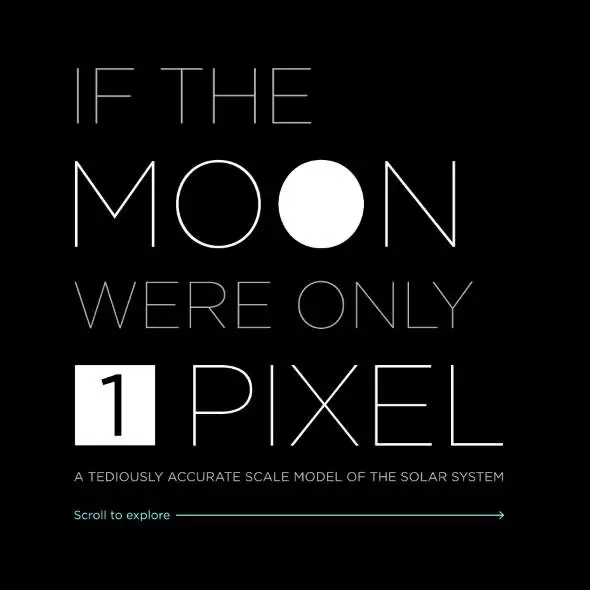
If our Moon were only 1 pixel in diameter on a map, what would be the scale of the Solar System? Artist and designer Josh Worth has created a great web page that actually answers this question: “A tediously accurate map of the Solar System“. He scaled the Moon to only one pixel (the radius of the Moon is 1,737 km / 1079.322 miles) and put the planets and other astronomical bodies such as the Kuiper Belt objects accordingly.
Since the human brain cannot deal with really large numbers, it is a good way to understand how big our Solar System actually is (spoiler: it is really big!).
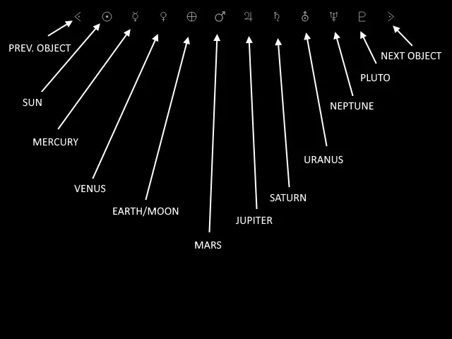
Click on the image below to see the animation. And get ready to scroll a lot, because most of the space is just… space.

While scrolling, you’ll go faster than light, but it’ll be like the solar system never ends. That’s how big the space is. As the English author Douglas Adams pointed out:
“Space is big. You just won’t believe how vastly, hugely, mind-bogglingly big it is. I mean, you may think it’s a long way down the road to the chemist’s, but that’s just peanuts to space.”


